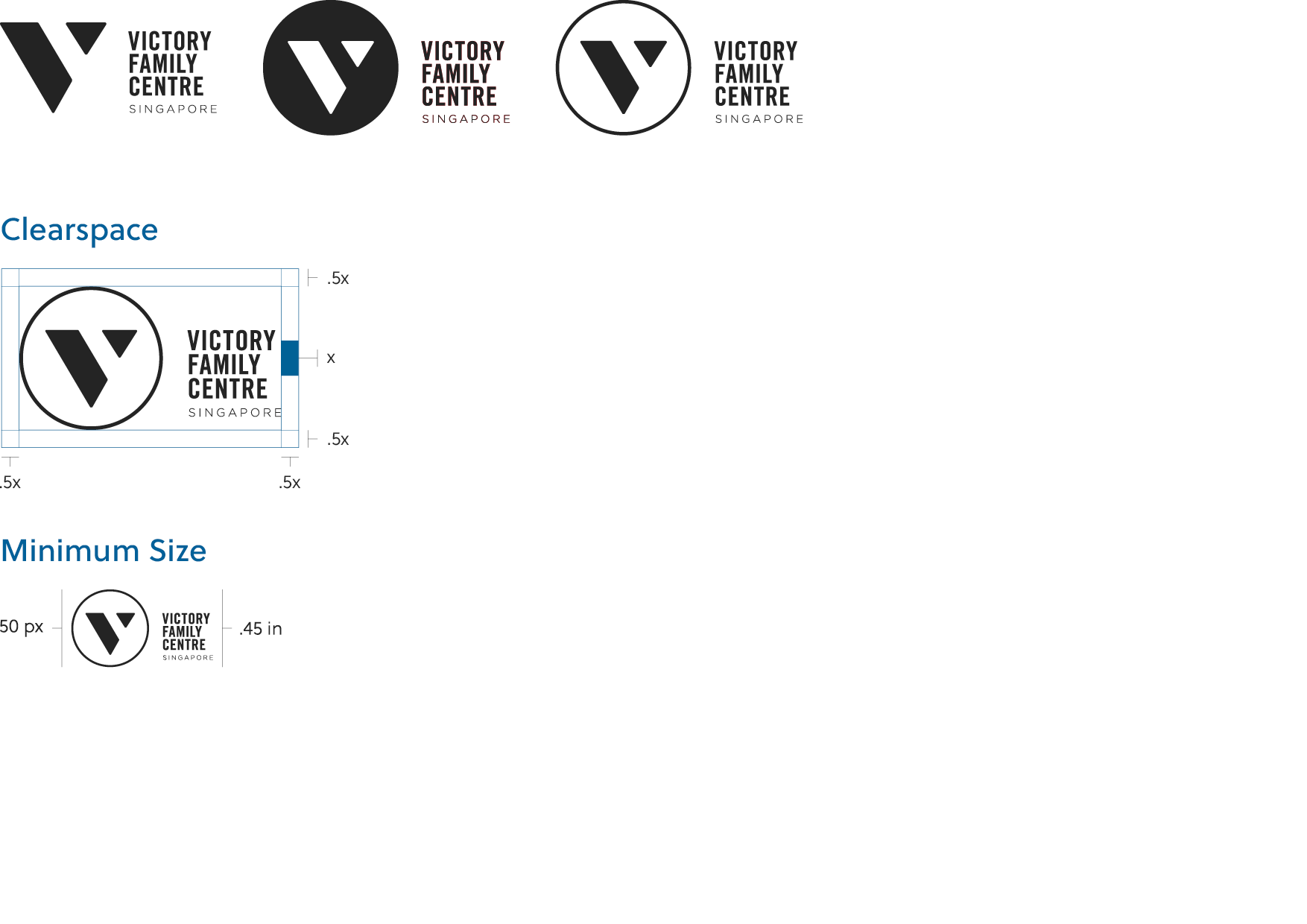
The logo must be perfectly legible and without obstruction at all times. For this reason, we ask that designers maintain a minimum area of clearspace around the logo that allows it to be displayed distinctly. The logo and all of its variations must always have the clear space that is specified below.
Also, be sure to notice the minimum size outlined in this section. We ask that these sizes be strictly adhered to and only used when absolutely necessary.
VFC’s horizontal stack logo also comes in 3 variations, and should be used when width contraints are tighter, and wordmark legibility is a key factor.