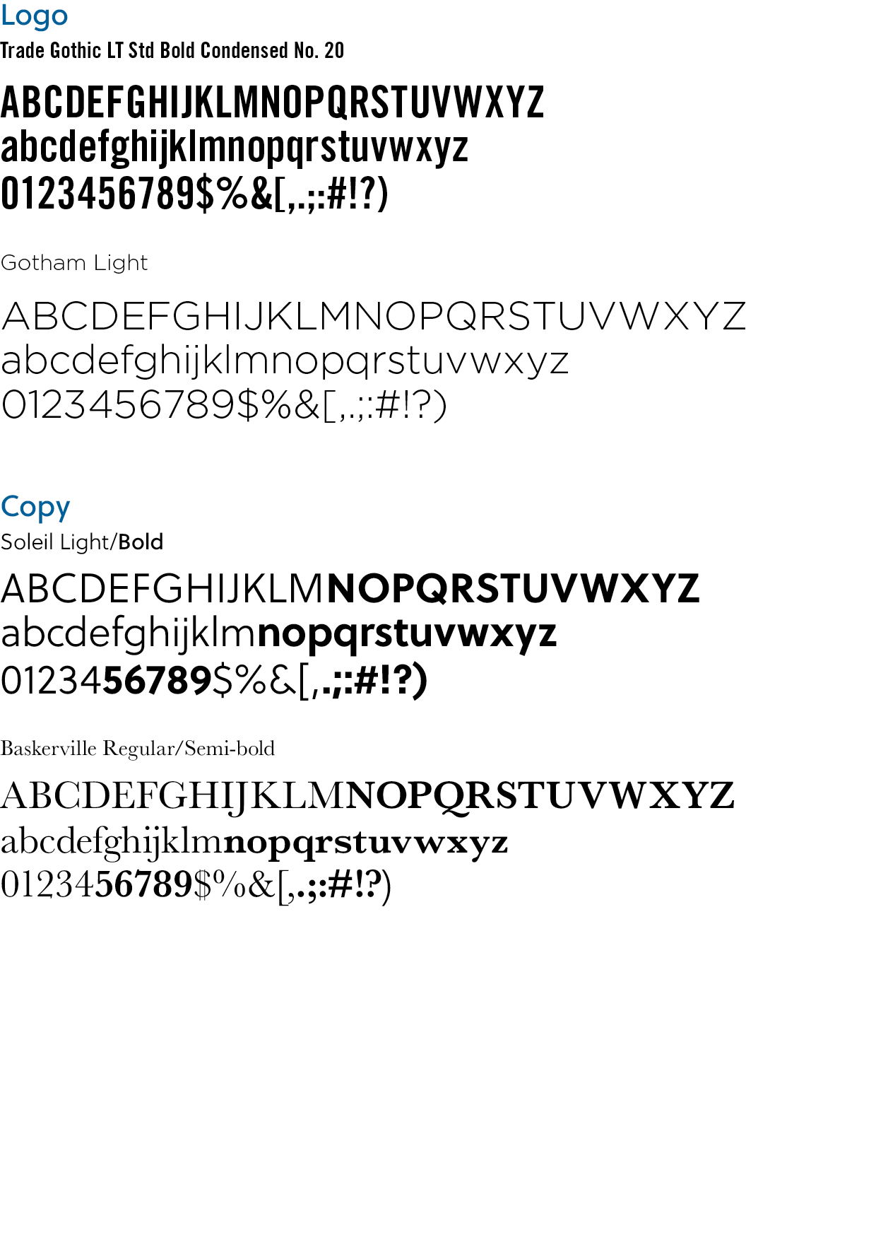
Victory Family Centre has distinct typography that are essential to brand identity. These fonts have specific uses, and should be used only in accordance with the following guidelines. Logo guidelines have been outlined in the Logo Elements section of this guide.
Both Gotham and Soleil are geometric sans serif fonts, which can me use collaboratively. In addition to being the font for the location identifier, Gotham is a heading font that can be used to break up large chunks of body copy. It should be used with a distinct separation is required with a clear visual hierarchy. For a more subtle heading hierarchy, Soleil can be used in a bold weight.
Baskerville is a traditional serif font, and should be used when the mood of communication, or the target audience errs more on the side of traditional.