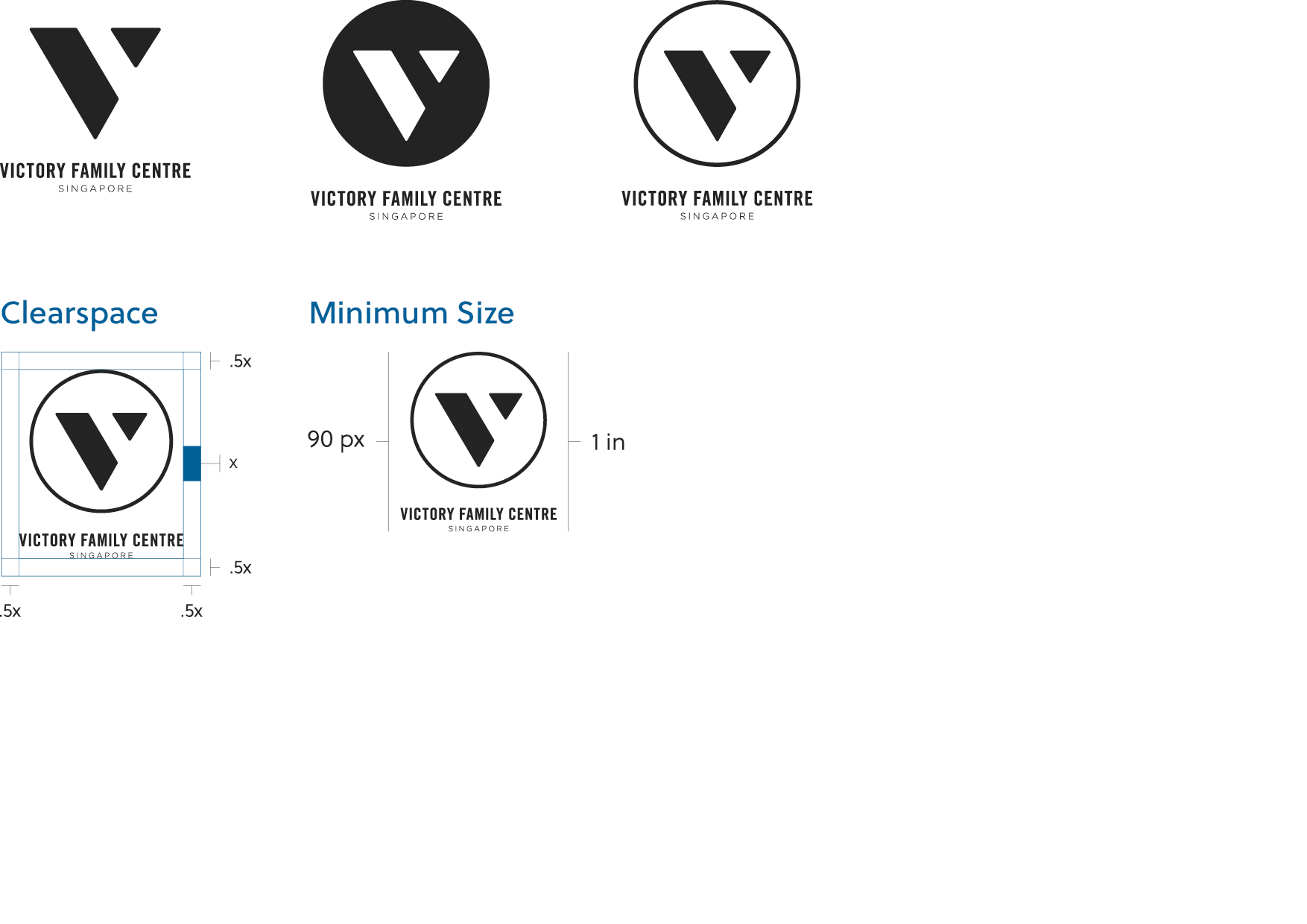
The logo must be perfectly legible and without obstruction at all times. For this reason, we ask that designers maintain a minimum area of clearspace around the logo that allows it to be displayed distinctly. The logo and all of its variations must always have the clear space that is specified below.
Also, be sure to notice the minimum size outlined in this section. We ask that these sizes be strictly adhered to and only used when absolutely necessary.
VFC’s vertical lockup logo is an icon-centric variation of the logo, which also accommodates all 3 icons. The vertical lockup should be used when the icon is the key element, and the wordmark is more supplementary.